Urban Knitting HTML Website:
http://www.fall10.graphicinterfacedesign.com/students/mbell/html/
Saturday, November 20, 2010

Wednesday, September 22, 2010
How to change the hover color of a link in CSS using Dreamweaver.
http://www.fall10.graphicinterfacedesign.com/students/mbell/tutorial/
This is a tutorial to show you how to change the hover color of a link in a CSS document, using Dreamweaver.
What's needed: A HTML document linked to a CSS sheet, open in Dreamweaver.
1. While working in the cascading style sheet, click on the "New Css Rule button" in the CSS Styles window on the right.


2. In the first drop down menu of the pop-up box, select "Compound (based on your selection)".
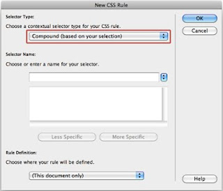
3. In the area for 'selector name' enter in "a:hover"

4. In the drop down box for 'Rule Definition', select "(This document only)"

5. In the new pop-up box, make sure 'Type' is selected on the left. Then to choose the color, click on the grey box to the right of the word 'color', and select a color.


6. Click Ok.
For questions, email meganbell6@gmail.com.
Tuesday, August 31, 2010
Site Critique
Site links:
HTML: http://www.peopleforbikes.org/
Flash: http://www.tcm.com/2010/suts/index.jsp
I chose the flash site, which is about a summer event that depicts movie stars each day of August.
I think there are a lot of aspects of this site that make it successful. I like the choice of mature colors and the simple, clean cut, yet efficient illustrations. They manage to send their message and make an impression by only using two to three colors (per page), and primarily silhouettes of images. They kept it clean, impressive, and professional while still properly displaying the content.
The navigation and smooth movement of it makes it more than your average web surfing experience. I think one of the best things about it is the way it uses movement. It's easier to feel more connected with the site, or understand where you are. As you move through different pages, it shows that movement between the sites, rather than transferring from page to page in a nanosecond, fast enough that the viewer can't watch the change.
They do a nice job of hierarchy by just having the main article take up a little more than the third of the page. That way, you can focus on the article you want, but still see what other articles there are. I think the way they've arranged (with the main article bigger and in the middle, and the other articles minimized above and below it) it gives you good feedback as to where you are in the site, but in a more creative way than 'Home>Stars>Bio'.
To help you navigate through the page, they have the site take on the aspects of a sort of visual wheel. If you click on a different article, the movement of the page implies that the page is spinning. The navigation is mostly really simple and easy to use. For the most part, all you have to do is click on the star you want to read about, or click on the 'Home' link at the top right.
There isn't much texture, which I think is fine.
The motion of it makes it smooth, enjoyable, and helpful.
Their choice of typefaces perfectly match the subject and style.
This site is mostly textual, but they do a good job of sprucing it up with simple, silhouette illustrations. The imagery helps, other wise the page might be pretty sparse.
Subscribe to:
Posts (Atom)